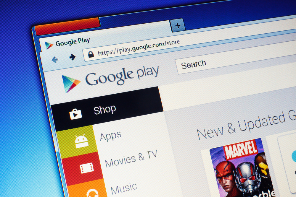
The Google app store is more often accessed from smartphones, but the company does not forget about the desktop version of the digital platform. The latter received a number of design innovations that are already available in test mode, and soon all users of gadgets on Android and Chrome OS will be able to evaluate the new look of Google Play.
In addition to the abandonment of the “flat” design, the site has undergone other cosmetic changes. The side navigation bar has been replaced by tabs at the top of the screen, and the apps themselves are further categorized by device type (smartphone, tablet, TV, or Chromebook), says 4PDA.
Application icons are still organized in a grid, but all tiles have rounded corners, and recommended applications are displayed in a carousel. In addition, the covers of books and films began to look more realistic, replacing the square icons with more proportional ones.
In general, the updated Google Play website has become much closer to the current Google Material You design language, notes NIX Solutions. Now, only a limited number of users can see the new “showcase”, but in the near future the innovations will become publicly available.