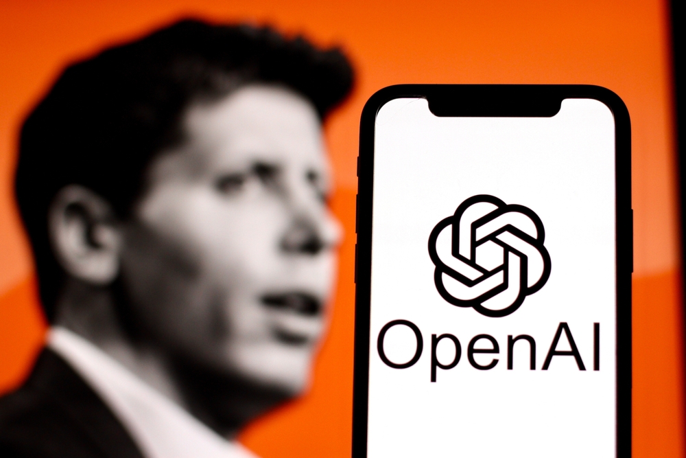
OpenAI has undergone a full rebranding, introducing a refreshed corporate identity with a new font, an updated logo, and a revised color palette. At first glance, the logo changes may seem minimal, but a closer look reveals key refinements. The “flower” emblem now has more space in the center, and its lines are clearer, enhancing the overall visual balance.
Originally designed by OpenAI CEO Sam Altman and co-founder Ilya Sutskever, the logo has now been subtly refined by in-house designers Veit Moeller and Shannon Jager. Their goal was to make the emblem feel “more organic and human,” aligning with OpenAI’s evolving design philosophy.

OpenAI Sans: A Balance of Precision and Human Touch
One of the most notable elements of the rebranding is the introduction of OpenAI Sans, a custom font designed to merge geometric precision with accessibility. According to OpenAI, the typeface features rounded, approachable characters while maintaining functional clarity. A key detail is the letter “O,” which has a perfectly round outer contour but a slightly irregular inner shape, symbolizing the contrast between robotic precision and human-like imperfection. Moeller confirmed that AI technology played a role in developing various aspects of the font.
AI-Driven Creativity in Branding
Beyond typography, OpenAI’s design approach integrates AI-driven tools with human expertise, adds NIX Solutions. “We collaborate with leading experts in photography, typography, animation, and spatial design, deploying AI tools like DALL-E, ChatGPT, and Sora as idea generators,” the company stated. This hybrid process, blending human intuition with AI’s generative capabilities, ensures that OpenAI’s branding remains both forward-thinking and deeply human.
These refinements reflect OpenAI’s ongoing efforts to create a cohesive and accessible brand identity. We’ll keep you updated as more developments emerge.
